lesson 1
HTML
what is HTML5?
It's difficult to properly discuss HTML these days without addressing HTML5 directly. It's a term that, in daily usage, encompasses far more than it outght to, and in general is used as a synonym for 'modern' or 'new' browser capabilities. Because newness is a moving target, attaching a number to the term can lead to confussion. So, what is HTML5, really?
HTML5 is the fifth major revision of the Hypertext Markup Language. It describes the elements and associated DOM APIs used to write .html documents.
From a developer's point of view, HTML5 is just HTML(version)5.
From a marketer's point of view, HTML5 is the new shiny.
HTML(v)5 is:
- new media elements:
videoandaudio - new structural elements:
article,section,header,footer,aside, etc - new graphics element:
canvas - new form elements and input types:
tel,email,number,color, etc - new support for local offline storage
- new support for drag and drop user interaction
HTML(v)5 isn't:
- Geolocation API
- WebGL
- CSS3
- ECMAScript5
- webworkers
- web sockets
Most importantly, HTML5 is whatever the browser vendors say it is. The main goal of the standards process is to document and standardize the technologies that are shipping in browsers today.
This is sometimes referred to as paving the cowpaths
The Document description
The doctype
Doctypes were introduced in order to allow developers to 'opt in' to writing standards compliant markup. As vendors started improving their browsers, older pages written with known bugs in mind no longer rendered properly. Doctypes have been used as a way to explicitly state that pages should be rendered in 'standards' mode, and not 'quirks' (ie. broken) mode. Of course, browsers did things their own way, and there were soon dozens of doctypes to trigger either standards or quirks modes. Now that HTML5 has established a rendering specification, there is now only one way to trigger standards mode:
    <!-- The new and improved way -->
    <!DOCTYPE html>
    <!-- The old and crappy way -->
    <!DOCTYPE html PUBLIC
      "-//W3C//DTD XHTML 1.0 Strict//EN"
      "http://www.w3.org/TR/xhtml1/DTD/xhtml1-strict.dtd">
The root Element
Like the doctype, the root element syntax has also been simplified:
    <!DOCTYPE html>
    <!-- The new and improved way -->
    <html lang="en">
    <!-- The old and crappy way -->
    <html xmlns="http://www.w3.org/1999/xhtml" lang="en" xml:lang="en">
The <head> Element
The head element contains metadata about the page and links to external resources.
metadata
The most important metadata is the character encoding of the page. Since some developers were forgetting to quote attribute values, most browsers now only care about the charset and ignore the rest. So, simplified again:
    <!DOCTYPE html>
    <html lang="en">
      <!-- The new and improved way -->
      <meta charset="utf-8" />
      <!-- The old and crappy way -->
      <meta http-equiv="Content-Type" content="text/html; charset=utf-8">
Although web servers send the encoding format in request headers, failing to specify character encoding is a serious security vulnerability.
Always specify character encoding with <meta charset="utf-8" />
Mobile
Metadata is a bit of a free-for-all, and there have been many different kinds introduced by interested parties. Apple was first to the modern mobile browser party, so they came up with this (now standard) syntax to define the behaviour of the viewport:
    <!DOCTYPE html>
    <html lang="en">
      <meta charset="utf-8" />
      <meta name="viewport" content="width=device-width,
        initial-scale=1, maximum-scale=1, minimum-scale=1, user-scalable=0" />
These attributes allow you to override the default width (set at 980px for iOS) and zoomability of the page. The above settings prevent all scaling and removes the ability to zoom. Use with caution!
Here's a couple more Apple-only settings to allow you to make your page more app-alicious:
      <meta name="apple-mobile-web-app-capable" content="yes" />
      <meta name="apple-mobile-web-app-status-bar-style" content="black" />
Facebook has their own set of metadata for Open Graph configuration:
      <meta property="og:title" content="Some title"/>
      <meta property="og:type" content="website"/>
      <meta property="og:url" content="Some url"/>
      <meta property="og:image" content="Some image"/>
      <meta property="og:site_name" content="Some site name"/>
      <meta property="og:description" content="Some description"/>
      <meta property="fb:app_id" content="1234567890"/>
links and external resources
Stylesheets
Although there are several others, the most important <link> to include in the <head> is to external stylesheets.
Since there is only one kind of style sheet format, we can dispense with the type attribute:
      <!-- The new and improved way -->
      <link rel="stylesheet" href="main.css" />
      <!-- The old and crappy way -->
      <link rel="stylesheet" href="main.css" type="text/css" />
Scripts
<script> tags can also be included in the <head>,
but beware that loading an external .js file will block page rendering, and generally make things feel very sloooooow,
so you'd better have a good reason to do so.
External .js should (almost) always be loaded at the bottom of the <body>
Since there is also only one kind of script file format, we can also dispense with a lot of fluff:
      <!-- The new and improved way -->
      <script src="js/main.js" charset="utf-8"></script>
      <!-- The old and crappy way -->
      <script src="js/main.js" type="text/javascript" charset="utf-8"></script>
Identifying the runtime environment
Because the <head> is parsed before any visible content, it is the best place to identify the current runtime environment,
and allows us to react appropriately in order to avoid some nasty FOUC.
Root classes
Classes attached to the top-level <html> tag can be used to separate style declarations in CSS,
making it possible to handle different runtimes individually.
The most basic test is whether we are running in an environment that has Javascript enabled:
    <!DOCTYPE html>
    <html lang="en" class="no-js">
At the first opportunity to execute Javascript, we can replace the no-js class with js.
Conditional IE comments
Browser wars are generally good for developers, but there is one war that will make your heart ache: Internet Explorer vs. everyone else.
One way to make life easier is with IE-only conditional comments wrapping the <html> tag.
This technique makes it possible to set root classes based on the version of oldIE in use,
giving you the opportunity to handle those browsers individually:
    <!DOCTYPE html>
    <!--[if lt IE 9]> <html class="ie" lang="en"> <![endif]-->
    <!--[if (gte IE 9)|!(IE)]><!--> <html lang="en"> <!--<![endif]-->
Feature detection
Taking this approach further, we can use Javascript to run a series of feature detection tests before the <body>
is rendered to determine what features the current runtime supports, setting root classes for immediate reference:
    <!DOCTYPE html>
    <!-- classes set at runtime via Modernizr -->
    <html lang="en" class="js no-touch postmessage
      history multiplebgs boxshadow opacity cssanimations csscolumns
      cssgradients csstransforms...">

      <script src="js/libs/modernizr-2.5.0.min.js"></script>
Avoid User Agent sniffing to determine capabilities. Feature detection is a far more reliable approach.
Although we want to avoid loading external Javascript in the <head>,
using a library like Modernizr to run feature detection tests is often worth the expense of delayed rendering.
Media queries
Media queries enable the conditional loading of .css files based on various environment properties, including width, height,
device-width, device-height, color, orientation, and resolution:
      <link rel="stylesheet" href="/css/mobile.css"
        media="only screen and (min-width: 320px) and (max-width: 640px)" />
      <link rel="stylesheet" href="/css/desktop.css"
        media="only screen and (min-width: 640px)" />
It's important to note that similar syntax is (more conveniently) available within CSS itself.
Putting it all together:
    <!DOCTYPE html>
    <!--[if lt IE 9 ]> <html lang="no" class="no-js ie"> <![endif]-->
    <!--[if (gte IE 9)|!(IE)]><!--> <html lang="no" class="no-js"> <!--<![endif]-->
      <head>
        <meta charset="utf-8">

        <title>Page title</title>

        <meta name="description" content="A web page">
        <meta name="author" content="Me">
        <meta name="viewport" content="width=device-width,
          initial-scale=1, maximum-scale=1, minimum-scale=1, user-scalable=0" />
        <meta name="apple-mobile-web-app-capable" content="yes" />
        <meta name="apple-mobile-web-app-status-bar-style" content="black" />
        <meta property="og:title" content="Some title"/>
        <meta property="og:type" content="website"/>
        <meta property="og:url" content="Some url"/>
        <meta property="og:image" content="Some image"/>
        <meta property="og:site_name" content="Some site name"/>
        <meta property="og:description" content="Some description"/>
        <meta property="fb:app_id" content="1234567890"/>

        <link rel="shortcut icon" href="favicon.ico">
        <link rel="apple-touch-icon-precomposed"
          href="images/apple-touch-icon-precomposed.png">

        <link rel="stylesheet" href="/css/basic.css" />
        <link rel="stylesheet" href="/css/mobile.css"
          media="only screen and (min-width: 320px) and (max-width: 640px)" />
        <link rel="stylesheet" href="/css/desktop.css"
          media="only screen and (min-width: 640px)" />

        <script src="js/libs/modernizr-2.5.0.min.js"></script>
      </head>
More tips for your <head>.
the document body
Semantics
HTML, like human languages, has a defined vocabulary with which one can express meaning and intent (semantics).
With only a 100 or so words (<elements>) to choose from, however, picking the right ones can be a challenge.
Semantic correctness helps improve accessibility and searchability, however, so it's generally worth the effort.
Choose the most semantically appropriate element to enclose your content.
Pick the right tag: don't use an a tag if you're not linking somewhere. Use a button instead
Like other languages, being concise is just as important as being correct, so when writing markup, less is best. As a result, it's important to avoid mixing extra presentational markup along with the semantic kind. Wrappers, spacers, containers, etc. are often necessary, but in all cases obfuscate meaning.
As much as possible, avoid presentational elements in your markup
Attributes
Each element, depending on it's type, may support one or more attributes in addition to the default ones
(id, class, style, title).
Tag specific attributes are used to provide additional information or configuration.
The majority of attributes are name="value" pairs, though some are boolean attributes:
    <input type='checkbox' checked /> <!-- true -->
    <input type='checkbox' checked="" /> <!-- true -->
    <input type='checkbox' checked="checked" /> <!-- true -->
    <input type='checkbox' checked="totally-checked-out" /> <!-- true, but weird -->
    <input type='checkbox' checked="true" /> <!-- true, but wrong syntax -->
    <input type='checkbox' checked="false" /> <!-- still true! -->
    <input type='checkbox' /> <!-- false -->
Boolean attributes are only false when they don't exist
IDs and Classes
All elements can have a unique id attribute. This serves both as an anchor link target for linking within a page,
and a means to identify an element in CSS or Javascript.
Elements can also have one or more class attributes. Classes are not unique, and enable multiple elements to share styling rules.
In general, ids are for scripting and classes are for styling
data-Attributes
HTML5 introduced the concept of data-attributes, which are custom attributes prefixed with 'data-'.
Although it's always been possible to add arbitrary attributes to any element, data-attributes are an approved way of doing so,
and enable the storage of custom data that can be retrieved later with Javascript:
<img src="small.jpg" data-src-medium="medium.jpg" data-src-large="big.jpg">
Structural Elements
Block vs. Inline
All visual elements are, by default, one of two types: block or inline.
Block level elements begin on a new line, take up all available width, and can contain child elements, including other block level elements.
Inline level elements, on the other hand, fall into the normal document flow, only take up their necessary width, and can only contain other inline elements as children.
Use div for block wrapping, span for inline wrapping
HTML5 elements
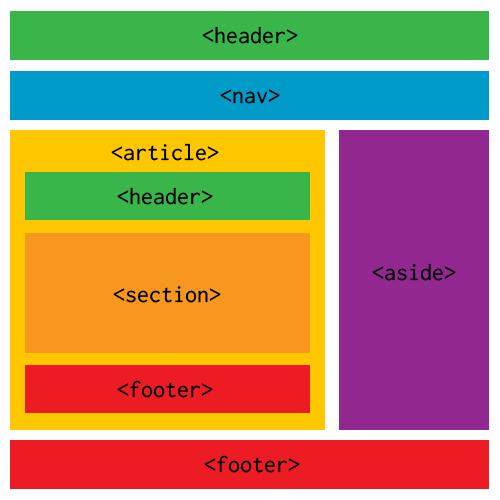
HTML5 has introduced a number of new structural elements to help with semantics.
article, header, nav, section, aside, and footer are some of the most important additions.
Choosing when to use each one can be a challenge, however, so here's a handy flow chart.
-
In general:
article: a collection of elements that can stand alone (news feed item, forum post, comment, story, etc)header: a collection of introductory or navigational aids for a page or sectionnav: major navigation within a page or site (not just a link or two)section: a collection of content that has a heading. Not a replacement fordivaside: content not related to the main contentfooter: a collection of metadata about the enclosing page or section
The section tag is not a wrapper for styling: use div for that
As with most things, we have to find a workaround for oldIE if we want to use any new HTML5 elements.
All browsers ignore unknown elements and render them with default inherited styling.
Applying custom styling behaviour is therefore up to developers, and is easily added with basic CSS.
OldIE, on the other hand, refuses to style any element is doesn't recognize, and simply ignores any style rules applied.
It will also remove any children of a block-level element it doesn't recognize, adding them as siblings instead.
Fortunately, there is a fix for both behaviours: create dummy elements first with Javascript before any unknown elements are parsed.
The best way to do this is add some Javascript to our <head>.
Modernizr does this for us by default, otherwise you can include an html5shiv.
Remember to patch HTML5 elements for oldIE
Media Elements
The video and audio elements add significant native multimedia capabilities to the browser,
but they are also significant for their introduction of nested source content:
    <video width="640" height="360" controls>
      <source src="high.MP4"  type="video/mp4" media="all and (min-width:601px)" />
      <source src="low.MP4"  type="video/mp4" media="all and (max-width:600px)" />
      <source src="regular.WEBM"  type="video/webm" />
      <source src="regular.OGV"  type="video/ogg" />
      <object width="640" height="360"
        type="application/x-shockwave-flash" data="fallback.SWF">
        <param name="movie" value="fallback.SWF" />
        <img src="poster.JPG" width="640" height="360" alt="__TITLE__"
          title="No video playback capabilities, please download the video below" />
        </object>
    </video>
This simple construct enables browsers to choose the first appropriate format, and degrades gracefully on all devices. With any luck, one day we could have this for images so we can serve low resolution versions easily to mobile devices:
    <!-- Not real code, just wishful thinking -->
    <picture alt="responsive image">
      <source src="hires.png" media="min-width:800px">
      <source src="midres.png" media="network-speed:3g">
      <source src="lores.png">
         <!-- fallback for browsers without support -->
         <img src="midres.png">
    </picture>
Graphics Elements
There are two primary graphics elements available: svg and canvas
svg is a type of retained mode graphics, where each object exists on a separate layer, and need not be redrawn repeatedly when moved.
It is a vector engine that generates drawn DOM elements, allowing for Javascript event handling and interactivity.
svg syntax is an xml derivative, and is not supported on oldIE.
The Raphaël library is a good cross-browser alternative.
canvas, on the other hand, is a type of immediate mode graphics engine on a single layer, requiring global redraws for object movement.
It is a pixel manipulation engine with a vector-like drawing API, text rendering, and support for exporting to static image files.
It comes in 2D and 3D (WebGL) flavours.
Forms
Forms are a world unto themselves, and have traditionally been the only mode of interaction between user and server. Because of this importance and interactive nature, forms can often turn ugly and complex. Beware!
At a basic level, a form is just a series of input elements that are sent to a server when submitted:
    <form action="path/to/some/script" method="post-or-get">
      <input id="name" type="text" value="">
      <input id="sex" type="radio" value="male">
      <input id="submit" type="submit" value="Submit">
    </form>
In practice, forms are a web of interconnected and complex ui elements you have little control over.
There are dozens of input types, each with it's own ui and styling unique to individual browsers.
There are date-pickers, ranges, checkboxes, color-pickers, file-uploaders,
and radio buttons, among others. There is even a hidden type used for all kinds of server voodoo.
Warning: actual code.
Keeping things simple will generally get the job done. Some guidelines:
formneeds anactionand amethod- an
inputcan be assigned a default value by prefilling thevalueattribute (required byradioandcheckbox) - associate a
labelwith a specific form element by nesting the element within thelabeltag - or, associate a
labelwith a specific form element by setting theforattribute to the element'sid radiobuttons with the samenameattribute are in the same group, with only one activated at a time- there are no restrictions on the types of elements nested within a
form(div,span,h1, etc.)
    <form action="path/to/some/script" method="post-or-get">
      <label for="first_name">First Name</label>
      <input type="text" name="first_name" value="">
      <label for="last_name">Last Name</label>
      <input type="text" name="last_name" value="">
      <label><input type="radio" name="sex"
        id="sexMale" value="male"> male</label>
      <label><input type="radio" name="sex"
        id="sexFemale" value="female"> female</label>
      <label for="email">Email</label>
      <input type="email" name="email" value="">
      <input id="submit" type="submit" value="Submit form">
    </form>
HTML5 forms
Much of the HTML5 spec involves improvements to forms:
- new input types:
color,number,date,range,email,tel,search,url, etc - new attributes:
placeholder,autocomplete,autofocus,maxlength,multiple,pattern,required, etc - validation of input values
Not all of these new toys are ready to play with, but since the default input type is text, you can safely use most of these today.
Use input types email, tel, url to customize the keyboard for mobile devices
Menus
The markup for menubars, dropdowns, sidebar navigation, and similar generally follows a common approach.
The link tags used to redirect the user are wrapped in one of two list types: ordered (ol) or unordered (ul):
    <nav class="sidebar-menu" id="sidebarMenu">
      <ul>
        <li><a href="section1">section1</a></li>
        <li><a href="section2">section2</a></li>
        <li><a href="section3">section3</a></li>
        <li><a href="section4">section4</a></li>
      </ul>
    </nav>
This approach illustrates clearly the concept of semantics and the separation of presentation from markup. A menu is just a collection of links, and, from an HTML point of view, that's all there is to it. The visual magic is all handled in CSS, which brings us to our next lesson...